
Project Overview
The aim of this project was to design a new flight booking website as the final project for my professional diploma in UX design. I was responsible for every stage of the UX design process, from research to final design.
My goal was to create a product with exceptional functional and experiential design, while maintaining a simple and visually pleasing aesthetic.
Through research conducted in the initial phase, it became clear that hidden costs, particularly those related to baggage, were a significant source of frustration for most flight booking website users. Addressing this issue became a key focus of the project.
User testing conducted at the end of the project demonstrated that this goal was achieved, resulting in a functional, user-friendly, and aesthetically pleasing experience.
RESEARCH
Online Survey
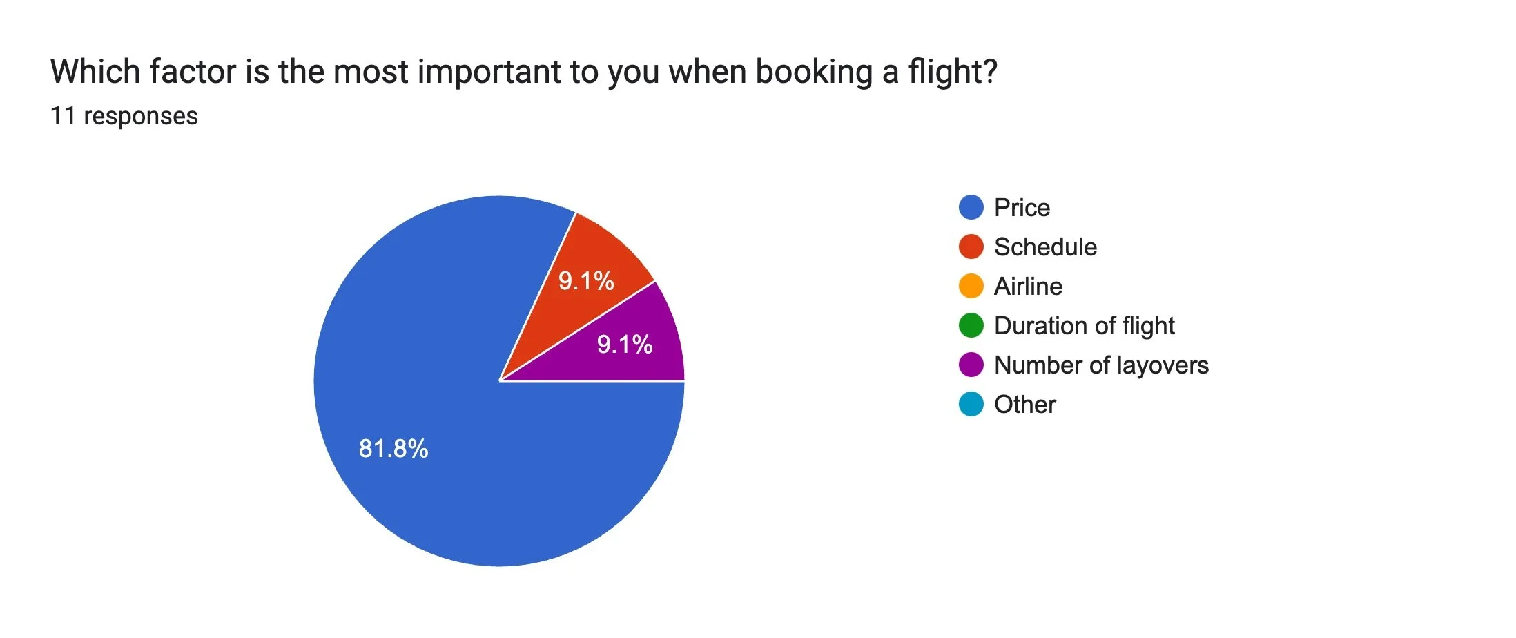
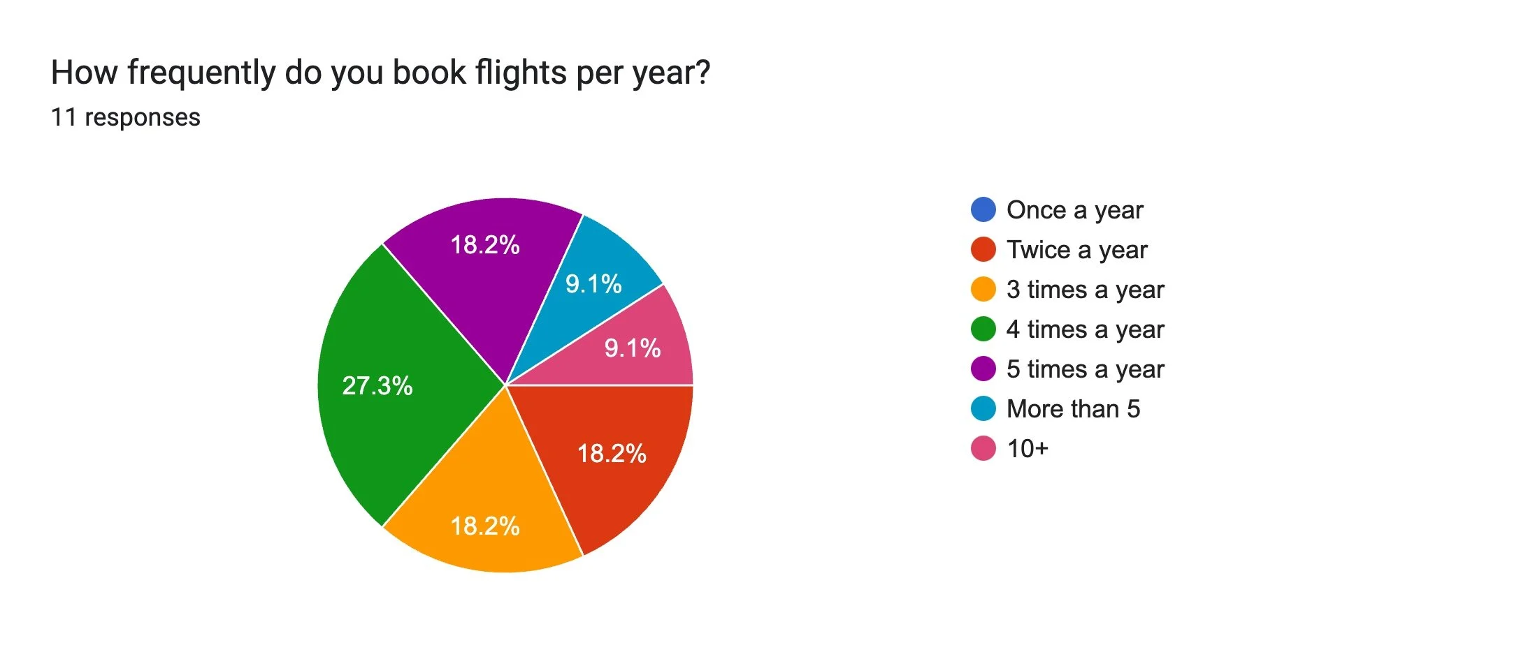
The first piece of research I conducted was creating and distributing an online survey. I ensured it included a mix of quantitative and qualitative questions, focusing on the three golden questions:
- • Why did you visit the website?
- • Were you able to complete your task?
- • What would you change about the website?
I received 11 responses to my survey, which comprised a total of 16 questions. Based on the feedback, a few initial pain points began to emerge, which became key areas of focus as I progressed with the design. The most notable issues were:
- • Hidden fees, particularly relating to baggage
- • The pushing of unwanted extras, such as insurance

Usability Testing
Usability testing was conducted on several established flight booking websites. I recruited one user to perform my own usability test, focusing on websites commonly used in Singapore. Additionally, I reviewed two pre-recorded tests provided by the UX Design Institute, from which I took notes and derived my own insights.
Issues identified across all platforms included the following:
- • Make key action buttons, such as "Search Flights", more prominent
- • Streamline fare selection by providing clear, concise explanations and reducing redundant prompts
- • Reformat flight timing details to avoid confusion between departure and arrival times
- • Remove unavailable options from the interface to minimise distractions
- • Simplify baggage policies by offering clear descriptions of what is included in each fare tier
DEFINE
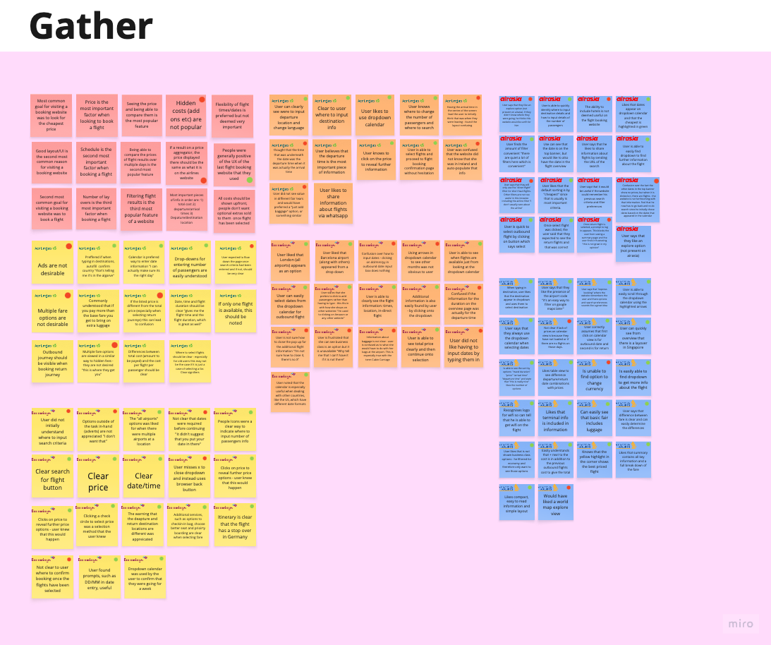
Affinity Diagram
As part of the define stage of this UX design project, I used an affinity diagram to organise and make sense of the data gathered during the research phase. I synthesised my findings by writing key insights, user quotes, and observations on post-it notes in Miro. Heuristic evaluations of the different websites were also included at this stage.
These notes were then grouped into themes and patterns, which helped uncover underlying trends and user needs. The grouping highlighted points at each stage that facilitated flow as well as pain points. This method was instrumental in identifying actionable insights and establishing a strong foundation for ideation and problem-solving.

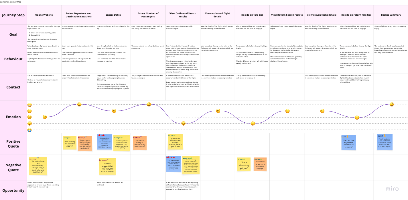
Customer Journey
I created a customer journey map in Miro to visualise the user experience as they interact with a product. This map was an amalgamation of all the research I had conducted and was not focused on one specific website. It highlighted several user problems and opportunities, particularly during the flight selection stages of the customer journey. As a result, these stages received special attention during the design process.
Research Take Aways and Definition of Key Issues
- All costs should be shown upfront
- Baggage and fare options are often poorly explained
- Users are most concerned about flight dates and times
- There is an established mental model
DESIGN
Flow Diagram
The first step in the design process was to create a flow diagram for an "idealised flow" through an "ideal product." This helped me understand where the screens I would create fit within the structure and allowed me to account for the product's various states.
The flow diagram adhered to the established mental model for flight booking websites:
- • Landing page with a search field
- • Outbound flight results/selection
- • Return flight results/selection
- • Flight confirmation
- • Passenger details
- • Payment

Sketches
I began the design process with sketches to accelerate decision-making through visualisation without wasting time. My sketches were informed by initial user interviews, research findings, and the heuristic evaluation. A key takeaway from this process was the importance of displaying all costs upfront, with baggage being the most common hidden cost.
One of the primary goals of the sketches was to ensure all costs were transparent from the beginning. To address this, I decided to include a baggage selection option in the search field - something rarely found on other websites.
Initial Prototype
With a clear vision of how I wanted my website to look, it was time to build a prototype in Figma. I translated my sketches into a medium-fidelity prototype, allowing a test user to book a flight, including baggage options, from Singapore to Bangkok for the dates 25/10/2024 to 04/11/2024.
I opted for a light, minimalist visual style that was both visually pleasing and free of distractions. While I didn't strictly adhere to any specific visual guidelines, I drew inspiration from the iOS style guide.

VALIDATE
With the medium-fidelity prototype built in Figma, it was time to validate my design through usability testing, as part of the iterative UX design process. I recruited a participant and conducted a usability test based on the flow the prototype allowed for.
ITERATED DESIGN
The final design built upon the previous iteration and incorporated the findings from the usability test conducted during the validation phase. Text and visuals were made smaller to improve scan-ability and facilitate comparison of search results, while also reducing the overwhelming feeling caused by large visuals. Additionally, the results filters are no longer hidden, allowing users to see which filters have been applied while comparing the results.
BUILD
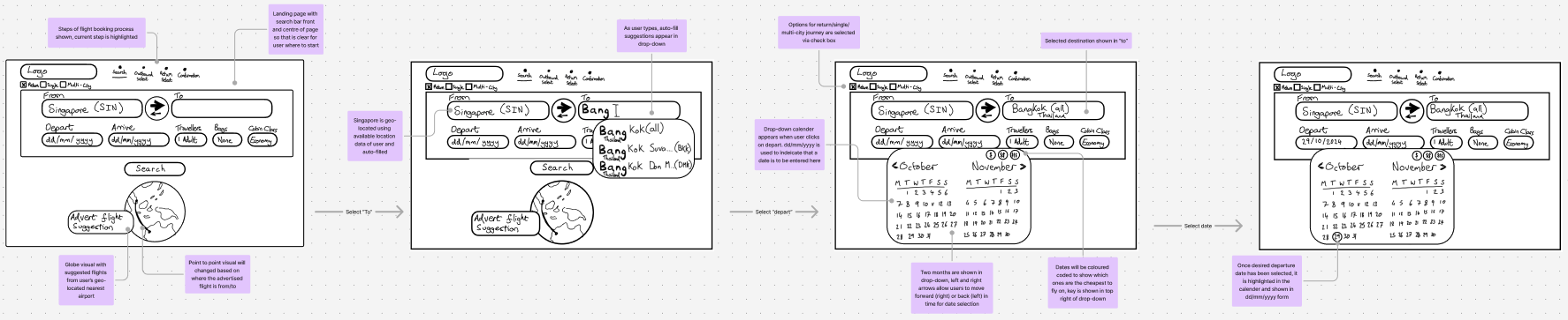
Annotations and Handover
Now that I was satisfied with the design and had validated it, it was time to hand it over to the developers for implementation. This involved annotating my designs to minimise the need for interpretation. The annotations included:
- • The rules and functions of each interaction
- • The behaviour of elements upon interaction
- • The feedback provided in case of errors